
How To Improve Cumulative Layout Shift Score
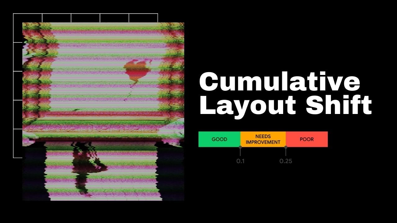
Cumulative Layout Shift (CLS) is a metric for visual stability of a webpage. CLS describes how often users experience unexpected layout shifts.
In this post, we'll see why CLS is important and how to prevent it.
Since it's a well defined metric, it's easy to see how you website is doing and if you need to improve.
I'll give you specific instructions on how to improve your CLS score by optimizing fonts, dynamic content, images, and ads.
Jump to:
Why CLS matters?
- Cumulative Layout Shift causes bad use experience for website visitors
- CLS is part of Google’s newly released Web Vitals. It's a set of critical performance metrics that will affect your SEO placement.
- It will become a ranking factor in May 2021
What causes CLS?
Web fonts, dynamic content, images, and ads are most common causes of a cumulative layout shift.
How is CLS calculated?
- CLS score is a multiple of Impact and Distance:
- Impact fraction is a measurement of how much space an element takes
- impact fraction = area of impact region / area of viewport
- Distance fraction
- Distance it has moved on the horizontal or vertical axis (whichever is greater), relative to the viewport.
- distance fraction = max move distance / viewport width or height
- Impact fraction is a measurement of how much space an element takes
- CLS score only counts shifts visible in the viewport (above the fold)
- Google counts a 0.5 second (500ms) of delay after the last user interaction before it starts counting it as your CLS score.
What is a good CLS score?
- Good CLS score is under 0.1.
- Score between 0.1 and 0.25 needs improvement.
- Score above 0.25 is poor.

What is my CLS score?
Measure your CLS score using Lighthouse. https://web.dev/measure
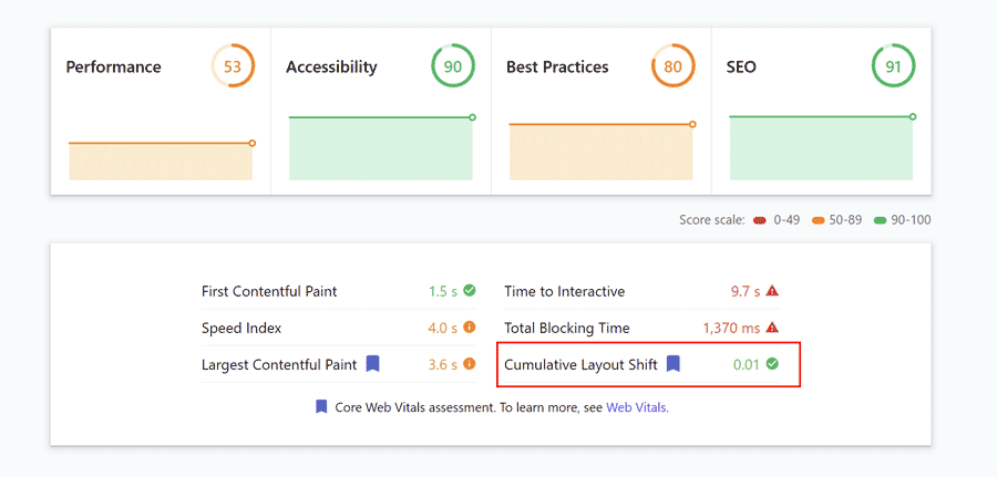
Lighthouse is a quick way to check the cumulative layout shift score.
How to prevent CLS caused by Fonts
Custom fonts look pretty, but they take time to load. Which can cause a layout shift.
With web fonts, we make a tradeoff between style, speed and usability.
The most common approaches are:
Hide text until font loads
- 🟢 Text shows up styled from the first paint.
🔴 Flash of Invisible Text - Text is invisible until the first paint.
Show text in default font ASAP and swap the font once the desired font loads
- 🟢 Text shows up immediately.
🔴 Flash of Unstyled Text - Text changes style when the swap happens
Fallback. Give fonts a short time to load. If it doesn't load in a time, use a fallback font.
- 🟢 Text shows up after a short time. Custom font gets a chance.
- 🔴 Not-perfect style - Fallback font might end up getting used.
Hiding text until custom font loads usually causes the biggest layout shift.
We can control this behavior using the font-display CSS.
Use font-display CSS property
The font-display descriptor determines how a font face is displayed based on whether and when it is downloaded and ready to use.
To fix the layout shift caused by fonts, the two best font-display options are:
font-display: fallback;
- If the desired font is not loaded, text renders with a fallback font face. It’s swapped in as soon as font loads.
- Gives the browser:
- 100ms to get the font before showing a fallback.
- 3 seconds to swap the font. Otherwise, uses the fallback font.
font-display: optional;
- If the font is available at the first paint, the browser will use it. Otherwise, it'll use the fallback font.
- Gives the browser:
- A chance to get the font before the first paint.
- No opportunity to swap the font.
According to CSS Fonts Module Level 4 spec:
An 'optional' font must never cause the layout of the page to "jump" as it loads in.
Use font-display: optional; if you want to prevent cumulative layout shift caused by fonts and you can make a tradeoff with styles.
Use a fallback font
Choose a fallback font that matches sizes of your desired webfont to prevent layout shifts caused by different widths and heights.
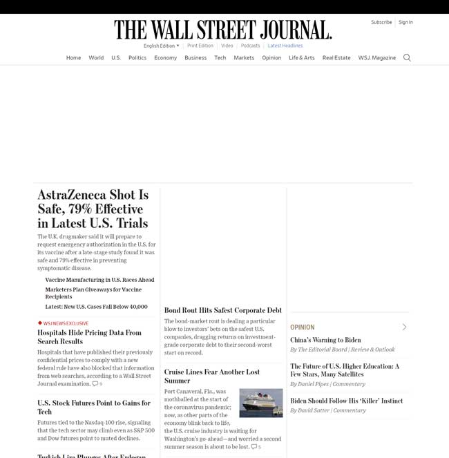
For example, The Wall Street Journal's fallback font and intended font overlap perfectly, not causing any shifts in layout:
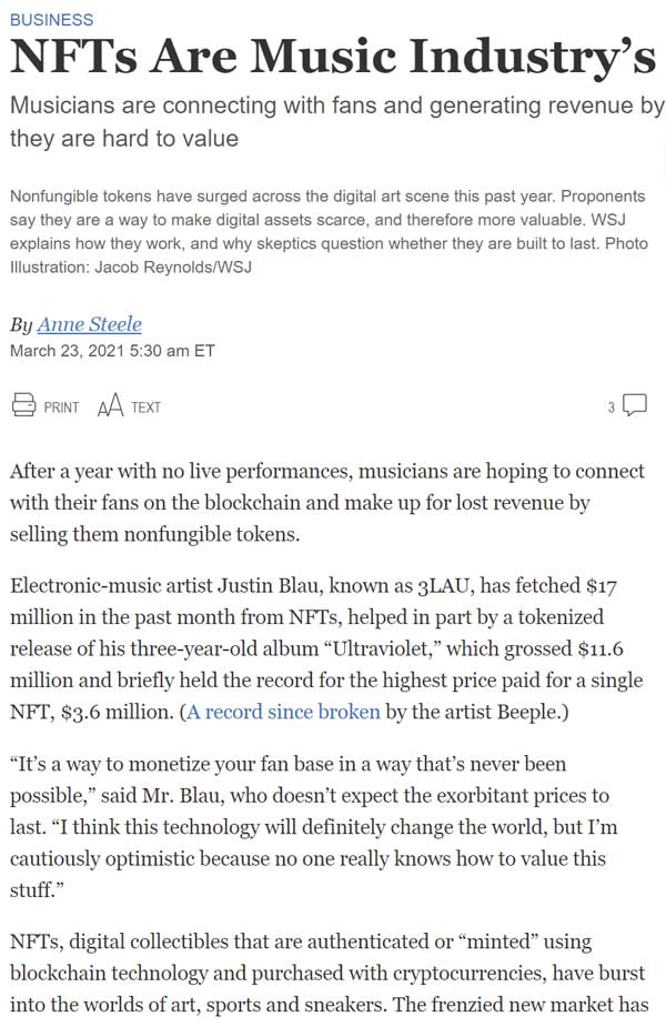
The fallback font
Before the desired font loads

The intended font
When the desired font loads
Can you spot the difference?
Fonts overlap perfectly
To define a fallback font, use the font-family property:
body {
  font-family: Helvetica, /* top choice */
      Verdana, /* if Helvetica is not available, use Verdana */
      sans-serif; /* if Helvetica and Verdana are not available, use any sans-serif that browser has */
}
Font style matcher is a great tool to find the best fallback font.
It makes it easy to find which fonts overlap the best.
Preload fonts
We can help a browser discover fonts quickly by adding:
<link
  rel="preload"
  href="fonts/font.woff2"
  as="font"
  type="font/woff2"
  crossorigin
/>
rel="preload" increases the chance that font will be available at first paint.
How to prevent CLS caused by Dynamic Content
Dynamic or lazy-loaded content is often a cause of layout shifts.
Using placeholders with a consistent width-to-height ratio (called an aspect ratio) is a great way to keep the layout consistent.
Avoid dynamic content above the fold
Not having dynamic content above the fold is the best way to prevent layout shifts.
Think about layout shifts should be part of web design.
Use CSS aspect-ratio property
The new aspect-ratio CSS property is the cleanest way of setting the aspect ratio for an element.

Image maintains the 2:3 aspect ratio despite different widths. © web.dev
aspect-ratio: 2 / 3;Aspect-ratio reduces or eliminates layout shifts because it reserves consistent width-to-height ratio for an element.
Unfortunately, many browsers don't support aspect-ratio property yet.
Check: Can I use aspect-ratio? for latest browser support.
If it's not supported yet in your targeted browser, see how to achieve the same using the padding trick.
Use the padding trick
We can reserve fluid space by maintaining aspect-ratio.
We can achieve a steady aspect-ratio using CSS padding properties.
padding-top and padding-bottom are based on the parent element’s width.
If we have a box with 900px width and we set padding-top to 50%. What will the height be?
The height of the box will be 450px.
Since padding is a percentage, it adjusts to changes in width. So, if width goes down to 400px, height will be 200px.
See the responsive demo in the video below. As I change the screen width, the box adjusts width and height to maintain 16:9 aspect ratio.
RatioBuddy is a fun tool to visualize, calculate and experiment with aspect ratios. As I change the screen width, the box maintains 16:9 aspect ratio.
.outer {
  position: relative;
}
.outer:before {
  display: block;
  content: "";
  width: 100%;
  padding-top: calc(
    1244 / 429 * 100%
  ); /* Let the browser calculate the aspect ratio
																				based on our 1244x429px box */
}
.outer > .inner {
  position: absolute;
  top: 0;
  right: 0;
  bottom: 0;
  left: 0;
}
How to prevent CLS caused by Images
Set height and width on images
Set the image width and height attributes on the img element, and browsers will figure out how much space to reserve for the image.
<img src="example.jpg" width="500" height="250" />How does the browser figure out how much space to reserve for an image?
Browsers have a built-in logic to maintain a consistent width-to-height ratio.
For example, Chrome adds the following CSS based on specified width and height :
img[Attributes Style] {
  width: 1000px;
  aspect-ratio: auto 1000 / 600;
  height: 600px;
}
It is using the aspect-ratio CSS property.
What if I don't know the image size?
Make the image fit your pre-defined space.
Add CSS declaration object-fit: cover; to the image.
Browser will clip the image to fill element’s entire content box.
<section
  style="
    width: 230px;
    height: 500px;"
>
  <img src="example.jpg" style="object-fit: cover;" />
</section>
Use the padding trick
See Use the padding trick. It applies to images too!
How to prevent CLS caused by Ads
CLS score only counts layout shifts that happen above the fold.
And above-the-fold ads earn the most money. And that's where most people put them.
So it's very important to load them properly for a good CLS score.
Since the ad loading process is usually the slowest, they load after the page content and cause a layout shift.
The most common technique is to reserve fixed space on the webpage for ads.
Reserve fixed space for responsive ads
Responsive display ads automatically adjust their size to fit in the designated space on the webpage.
Responsive display ads have the most reach of all display ads because they're made to fit nicely across different device sizes. So it makes sense that Google has been pushing for responsive ads since 2019.
But the variability of ad dimensions causes cumulative layout shift because we don't know exactly which advert will load.
Google recommends providing exact ad dimensions for different screen sizes.
<style>
  .responsive_ad {
    width: 320px;
    height: 100px;
  }
  @media (min-width: 500px) {
    .responsive_ad {
      width: 468px;
      height: 60px;
    }
  }
  @media (min-width: 800px) {
    .responsive_ad {
      width: 728px;
      height: 90px;
    }
  }
</style>

<script
  async
  src="https://pagead2.googlesyndication.com/pagead/js/adsbygoogle.js"
></script>

<ins
  class="adsbygoogle responsive_ad"
  style="display:inline-block"
  data-ad-client="ca-pub-XXXXXXX11XXX9"
  data-ad-slot="8XXXXX1"
></ins>

...
What do these styles mean?
- For browser windows:
- Narrower than 500px → use 468×60 banner ad
- Wider than 500px but narrower than 800px → use 468×60 banner ad
- Wider than 800px → use 728×90 leaderboard ad
Keep in mind that different ad sizes perform differently. Experiment to find which ad sizes bring the best results for you.
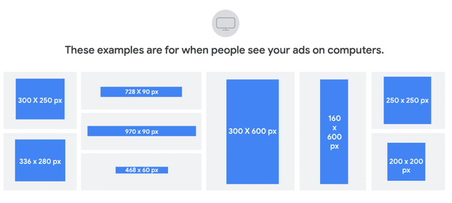
Example: Ads on The Wall Street Journal
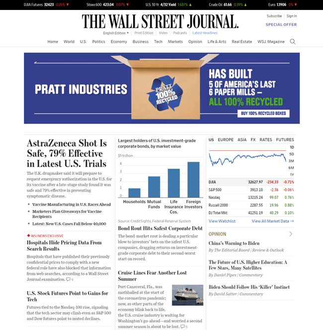
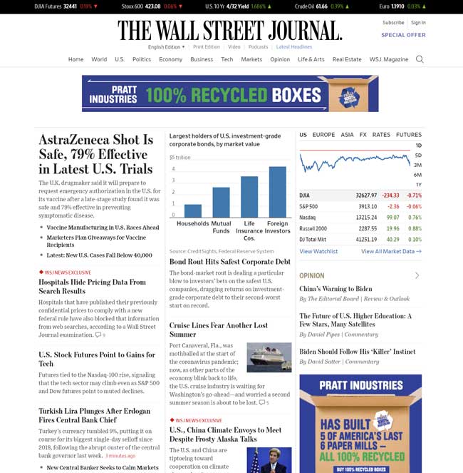
Loading ads is a dynamic process.
There are many factors that impact which ads will show up. Some of them that WSJ looks at are:
- User's geolocation
- User's screen size
- Number of pages viewed
- Is GDPR required?
The WSJ currently has 6 bidders and different dimensions for each ad slot. For example, two different ad sizes can show up just below the WSJ headline. 728x90px or 970x250px.
The WSJ takes the safe approach and reserves 250px in height to prevent the cumulative layout shift down.
In case that the bigger ad loads, the content won't shift at all.
But if smaller ad loads, the content will shift up rather than down.
Since the ad size is dynamic, the shift up is a better tradeoff because it prevents people from accidentally clicking on the ad. The worst it can happen is accidentally clicking on the wrong article.
Takeaways
Cumulative Layout Shift (CLS) describes how often users experience unexpected layout shifts.
- CLS will affect SEO starting May 2021.
- CLS score is a multiple of:
- Impact (how much space element takes), and
- Distance (how far element moves).
- Aim for CLS score under 0.1.
- Layout shifts within 500ms of the last user interaction are OK.
- Use Google Lighthouse to measure your score.
- Web fonts, dynamic content, images, and ads are most common causes of a cumulative layout shift.
To prevent CLS caused by Fonts:
- Experiment with the font-display CSS property.
- Pick an alternative font that matches style of your desired font.
- Use
rel=preloaddirective to quicker notify browsers of custom webfonts.
To prevent CLS caused by Dynamic content:
- Try to avoid dynamic content above-the-fold.
- Set an aspect-ratio using the CSS aspect-ratio property
- Use padding to reserve space for an element
To prevent CLS caused by Images:
- Set Height And Width On Images
- Use object-fit CSS property to make images fit dynamic containers.
- Use the padding trick to set the aspect-ratio
To prevent CLS caused by Ads:
- Reserve fixed space on the web page


Josip Miskovic is a software developer at Americaneagle.com. Josip has 10+ years in experience in developing web applications, mobile apps, and games.
Read more posts →- Why CLS matters?
- What causes CLS?
- How is CLS calculated?
- What is a good CLS score?
- What is my CLS score?
- How to prevent CLS caused by Fonts
- Use font-display CSS property
- Use a fallback font
- Preload fonts
- How to prevent CLS caused by Dynamic Content
- Avoid dynamic content above the fold
- Use CSS aspect-ratio property
- Use the padding trick
- How to prevent CLS caused by Images
- Set height and width on images
- How to prevent CLS caused by Ads
- Reserve fixed space for responsive ads
- Takeaways

I've used these principles to increase my earnings by 63% in two years. So can you.
Dive into my 7 actionable steps to elevate your career.