Landing Page Conversion Optimization: Proven Guide for 2023
You've built a beautiful landing page, but you're not getting the conversions you want.
There are a lot of elements to consider when optimizing a landing page: headlines, copy, design, calls-to-action (CTA), form length...
With so many elements on a page competing for attention, it's hard to know which ones are most effective at driving conversion.
What changes should you make to your landing page?
There are no magic bullets. Conversion rate optimization software won't magically solve your problems.
Landing page optimization is an ongoing process that requires testing and experimentation to find what works best for your business.
In this blog post, I will show you the top techniques that work in 2023 and how you can apply them to your landing pages.

What is a good landing page conversion rate?
A good landing page conversion rate is anywhere around 10%. The average landing page generates 5-15% conversion rate.
But remember to always use absolute numbers next to ratios. If there are fewer than 100 conversions, the sample size is too small to be statistically significant.
What isn't working on your landing page? What is going well for you?
Before you test new landing page elements, it's important to know what does and doesn't work on your current website.
Start by analyzing your landing page traffic and conversion data.
Heatmap
One way to do this is to look at your website's heat map. A heat map shows you how users are interacting with your page by mapping out where they're clicking and scrolling.
User behavior tells you a lot about your landing page experience.
Session replay
Session replays are recordings of user sessions. They allow you to watch how users interact with your website in real-time.
Watch what they did on your website — how far they scrolled, what they clicked and what they didn't click — to see where you can make improvements.
Surveys
Another way to find out which elements of your landing page are working is by conducting surveys with customers who have recently interacted with it.
When asking questions, be sure not to skew the answers in any direction.
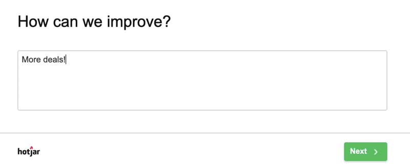
Survey pop-up added using Hotjar.
Page speed
Page speed is an important factor that affects your landing page's conversion rate.
49% of Internet users expect web pages to load in 2 seconds or less, according to Akamai's research.
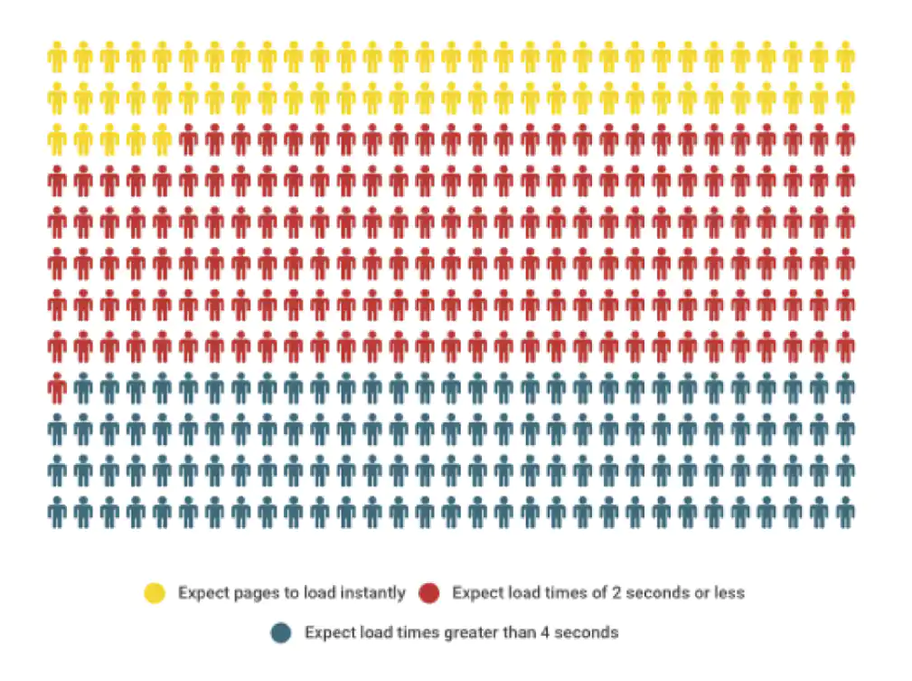
Representation of Akamai's research.
There are several things you can do to improve your page speed, such as optimizing images, reducing the size of scripts and style sheets, and caching static files.
Here are some tools to help you improve your page speed:
- Google PageSpeed Insights - analyzes a webpage and provides suggestions on how to improve its performance.
- Pingdom Website Speed Test - generates reports that show the load time of every resource, as well as overall load times.
- WebPage test - offers a free online service that measures the load time of your website and provides suggestions on how to improve it.
Page load time is especially important for mobile devices.
Headline
The headline is the most important element of landing page optimization.
You will lose your visitors within seconds if your headline doesn't capture their attention.
You need to get their attention fast and persuade them to continue reading your landing page.
The headline is the first thing they see, so it's a good idea to make it as interesting as possible. It should give visitors an overview of what they can expect if they convert to this offer.
Focus on the pain and paint the dream of how they can eliminate that pain.
Be sure to focus on the benefits of your product/service. Don't waste time talking about features that don't matter.
What benefits does your product/service offer?
How can it solve their problem or help them meet their goals?
When you talk their language, they will feel that you understand them.
If you can, try to use the exact words they would use when talking about their problem.
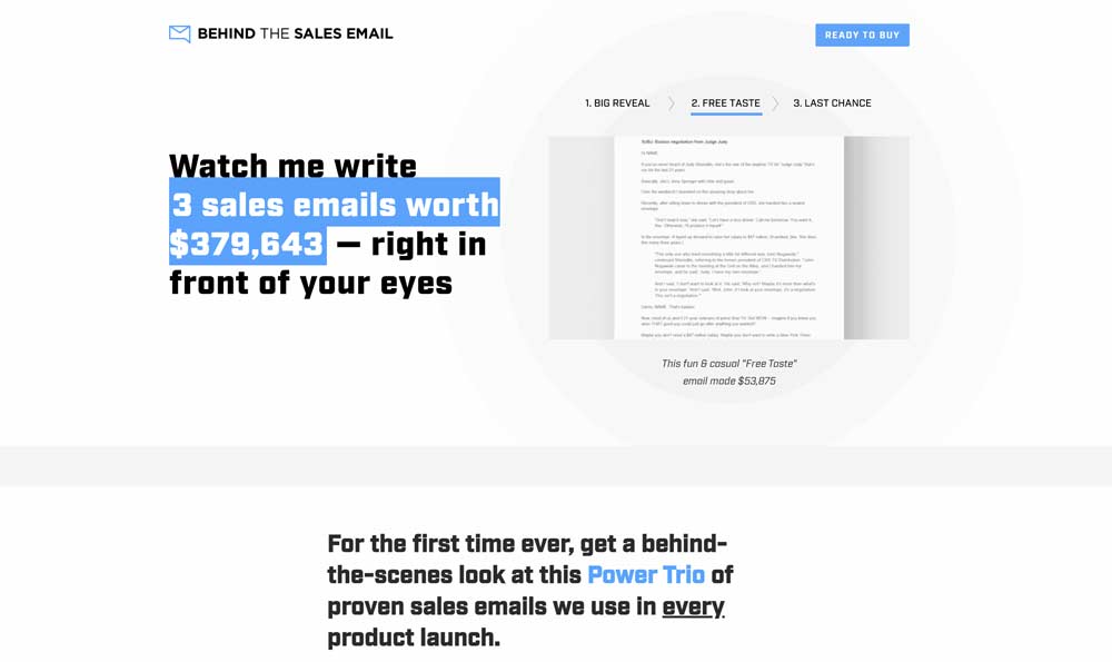
Effective headline grabs attention immediately.
Grab Attention
One thing that can kill your conversion rate is boring landing page content.
If you feel even slightly border while reading your copy, your visitors definitely will.
Landing page optimization is all about grabbing your visitor's attention.
PAS Framework
The PAS Framework is a great tool that can help you with landing page optimization. It gives you a simple framework to create a landing page that talks directly to your target audience.
PAS stands for Problem-Agitate-Solution.
Problem
You must show that you understand the problem before you offer the solution.
The more you understand their pain, the greater your credibility will be.
Talk about the problem and use their language to show that you understand it well.
The goal is to get your visitors nodding their heads in agreement and convinced that you understand them.
When they're finished reading, they should feel you've been through the same struggles they've been through.
Agitate
Your job is to agitate their pain by describing the problem in more detail and showing just how big of a deal it really is.
You really want to get inside their head and make them feel the pain you're describing.
Solution
Only after you went through the problem and agitated it, you'll be able to offer a solution.
This is the easiest part.
Show how your product or service can solve their problem once and for all.
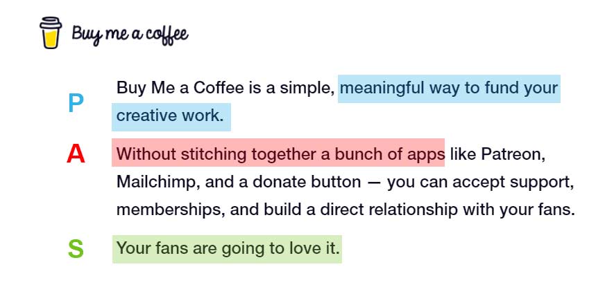
Problem-Agitate-Solution copywriting used by Buy me a coffee
Colors
Which color is your landing page?
Colors are a crucial factor that will make your CTA buttons stand out.
The colors you choose for your landing page should be complementary to the color of the CTA button.
Complementary colors are two colors that are on opposite sides of the color wheel. This color combination has a lot of contrast and impact. They'll appear brighter and more prominent when combined. That will make your CTA buttons pop out and increase your conversion rate.
Make sure that you are not using your button color anywhere else other than on the CTA button. Otherwise, it won't look as important.
I've used this simple trick to increase conversion rate by 80%.
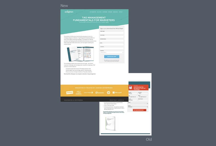
Landing page redesign by ToTheWeb.com focused on colors.
Navigation Bar
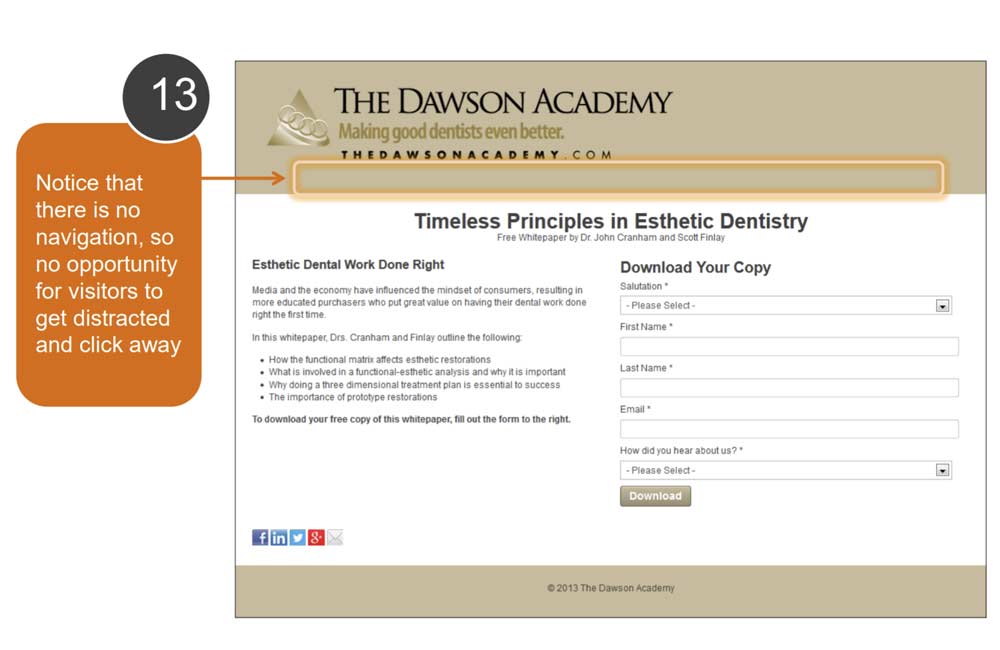
The purpose of your landing page is to get the user to convert, so don't distract them with your website's navigation bar.
If you are trying to get the user to sign up for a webinar, don't include links to your blog or about page.
The fewer distractions there are on your page, the more likely the user is to convert. That's why it's important to understand what your goal is and to make sure that everything on the page serves this purpose.
Remove anything from the landing page that does not lead directly to a conversion.
If you have additional offers, provide them after conversion. For example, in an email after they've signed up for your offer.
Trust
Trust is a key factor that affects your landing page's conversion rate.
People are more likely to convert if they trust your website. There are several things you can do to increase the trustworthiness of your website, such as adding security badges, displaying customer testimonials, and having a privacy policy.
Add security badges, customer testimonials, and a privacy policy to increase trust.
A/B Tests
A/B testing, also known as split testing, is a method of comparing two versions of a webpage or email to see which one performs better. You can test different elements, such as the color of a CTA button, the text on a headline, or the position of a form field.
A/B tests give you confidence that you're moving in the right direction, and they help you make educated decisions about what works best for your target audience.
Use A/B testing to improve conversion rate with confidence.
There are several tools that can run A/B tests for you:
- Google Optimize - a service from Google with free basic features. It's also integrated into other Google services like Gmail and Analytics.
- Visual Website Optimizer - a standalone service that offers advanced features. Pricing depends on the number of tests you want to run and your traffic volume.
- Optimizely - an integration with other services like Google Analytics, Salesforce, MailChimp, and HubSpot. It also has mobile apps for iOS and Android. Pricing depends on the number of tests you want to run and your traffic volume.
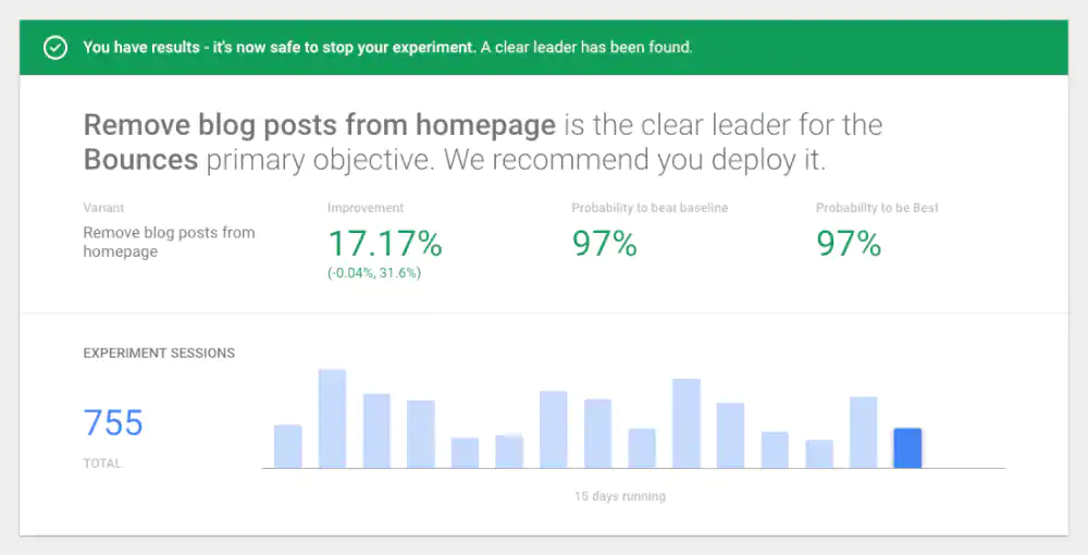
Google Optimize Dashboard
Forms
How many fields does your landing page form have?
If you want to increase your landing page's conversion rate, it's important to make sure that your forms are easy to fill out.
The fewer form fields you have, the more likely the user is to fill them out.
Make sure that the labels are clear and concise, and that the form fields are easy to navigate.
Keep your form fields to a minimum and make them easy to fill out.
Capture the lead first. You'll have time to ask for additional information later.
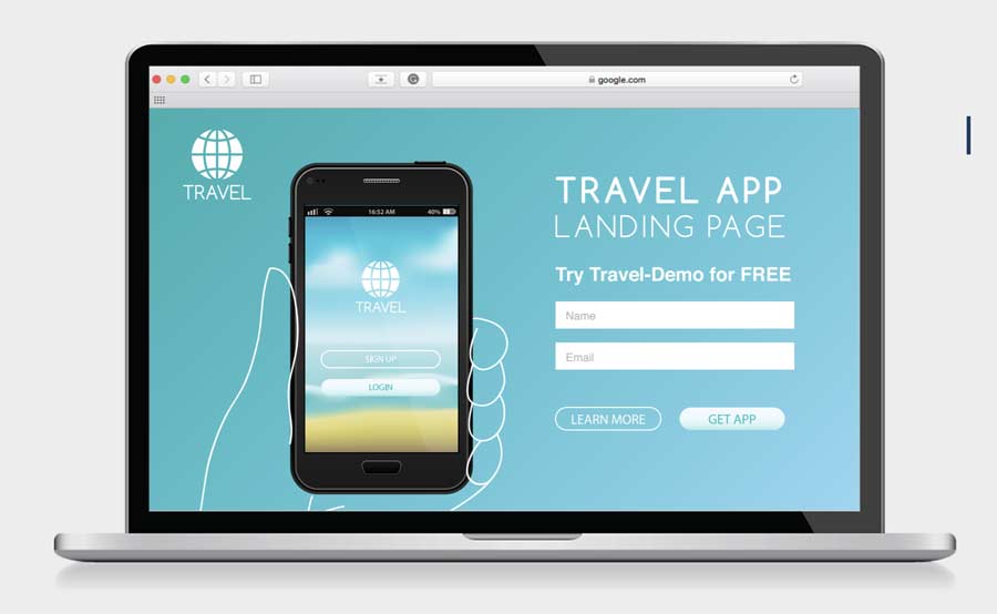
Simple form captures just the first name and email.
Social Proof
Social proof is the phenomenon of people following the actions of others.
That's why testimonials are such a powerful tool on landing pages. People are more likely to convert if they see that other people have already done so.
Address objections
One of the most powerful landing page optimization techniques is addressing objections.
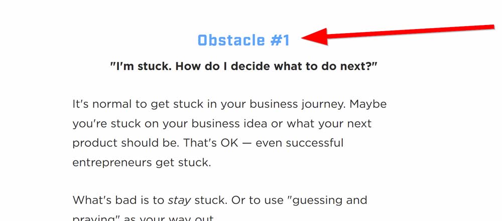
growthlab.com is addressing objections directly.
As your web page visitors are reading through your landing page, they will be raising objections in their minds.
You need to address these objections directly and show them that you have a solution for them.
Address the objections that your web page visitors are likely to have.
For example, if you are offering a free trial, some of the objections might be "I don't want to give my credit card information". So clarify that you don't require a credit card for the free trial.
Features
Introduce features towards the middle of your landing page.
Talk about on the results that you can bring to your target audience. Having a feature-packed product is great, but it doesn't matter if they're not bringing value to the people you're targeting.
Bullet points
People are more likely to convert if they can quickly see what you're offering and what benefits it has for them.
Use bullet lists to highlight the features of your product or service.
Make sure that your bullet points are clear and concise, and that they focus on the benefits of your product or service.
Guarantee
Every high performing landing page has some sort of guarantee.
People are more likely to try your product or service if they know you stand by it and will make things right for them.
A money-back guarantee is a great way to offer this reassurance.
Make your terms and conditions clear, and make sure that your guarantee is easy to find on your landing page.
Add a money-back guarantee to increase confidence in your product or service.
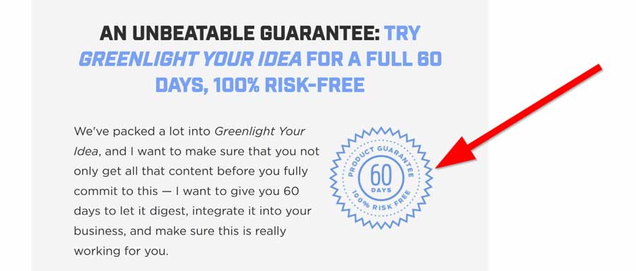
Money back guarantee.
Images
Images are a critical part of landing pages.
They help to break up the text, and they help your visitors understand what you're offering.
Make sure that your images are high quality, and that they support the message of your landing page.
When web visitors are moving quickly through landing pages, they're scanning in and out. That's why it's critical to use images that are of high quality.
Invest money in high-quality images, and you'll be rewarded with higher landing page conversion rates.
Search engine traffic
I often see landing pages that are completely isolated from search traffic. That's mostly because companies link to landing pages directly from ads.
There's no doubt that paid traffic is a great way to increase your landing page's conversion rate. But you're leaving money on the table if you're not optimizing for search traffic.
Optimize your landing pages for both paid and organic search traffic.
You already gave great content on your landing page, so there's no reason not to take advantage of search engine traffic.
I don't recommend spending too much time on landing page SEO unless you're seeing a significant portion of your traffic coming from search engines. Just cover the basic on-site search engine optimization best practices.
Match the offer
How many times have you clicked on Google Ads and it took you to a landing page that has nothing to do with what you were looking for?
Most landing pages fail to match the offer in the ad.
Optimize landing pages for the ads that they're being used for.
Targeted landing pages are one way to increase landing page conversion rates.
When you create targeted landing pages, make sure that the offer on the landing page matches the offer in the ad.
This is a common mistake that many companies make. They create generic landing pages and use them for all of their campaigns even though it's for the different target audiences.

Landing page doesn't match the offer from the Google ad.
Tools
There are various landing page optimization tools that you can use to improve landing page conversion rates.
Before you jump on and install an optimization tool, make sure that it's the right tool for the job.
There are so many landing page elements that you might end up wasting your time with a tool that's not the right fit for you.
For example, chatbots.
I've seen landing pages where the chatbot completely messed up the landing page experience. The little pop-up was intrusive and killed the user experience.
Viral landing pages
When your landing page goes viral, that's when you know you have a perfect landing page.
Viral landing page conversion rates tend to be much higher than non-viral landing page conversion rates.
There are a few things that you can do to increase the chances of your landing page going viral.
First, make sure that your landing page is high quality and provides value to your visitors. If your landing page is helpful and interesting, people will be more likely to share it with their friends.
Second, make sure that your landing page is easy to share. Add social media buttons, and make it easy for people to post links to your landing page on their social media profiles.
Third, promote your landing page on social media and other online channels. Make sure that you target the right audience, and use the right keywords in your marketing materials.
Free converts well
Landing pages that offer free stuff have a conversion rate of over 50%.
If you are selling an expensive product or service, landing pages with a free offer can help you drive more leads.
Get creative with your free offers. You don't have to give away your entire product or service for free.
For example, a flower shop, Just Add Ice Orchids, created a giveaway for 30 free orchids. The landing page had a phenomenal conversion rate of 87.5%.
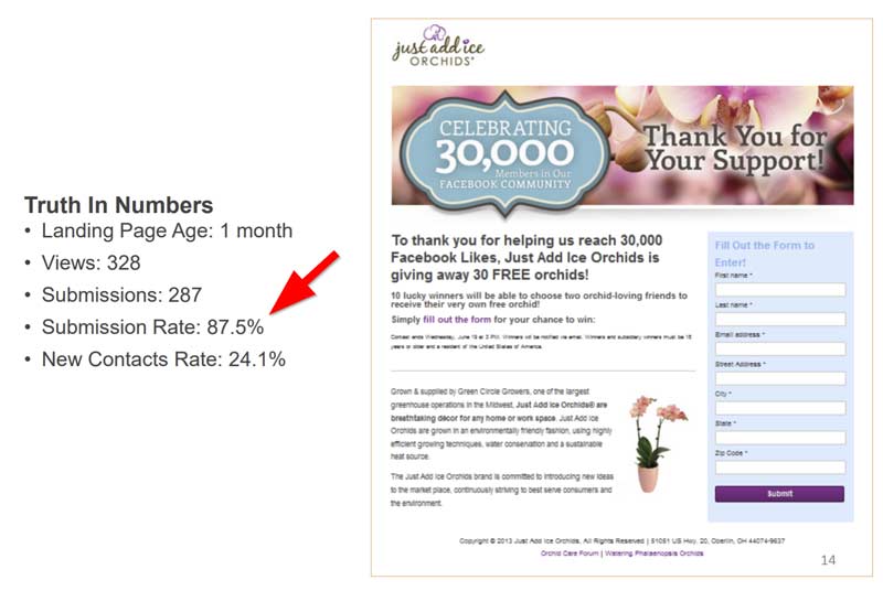
But before you get all excited, make sure that the free offer is relevant to your landing page and helps you achieve your marketing goals. Your goal is to turn those leads into customers.
Get inspired by top landing pages
One of the best ways to improve your landing page conversion rate is to study conversion rate optimization examples.
See what they're doing well and try to incorporate some of those elements into your own landing page.
For example, if your landing page is for a product, look at the landing pages of top companies in that industry. See what they're doing well and try to emulate their strategy.
Landing pages are constantly evolving, so it's important to keep up with the latest trends.
Keep testing
I recommend testing at least one new idea every month. This will help you find the best methods for increasing your landing page's conversion rate.
Landing page optimization is a never-ending process.
Conclusion
Landing page conversion optimization is a critical part of any online business.
Landing page optimization can help you increase your landing page conversion rate by 50% or more.
Landing pages that are properly optimized for conversion will help you achieve your business goals.
Landing page optimization cheat sheet
We've covered some basic landing page optimization techniques that you can use to improve your conversion rate.
Here are the major landing page optimization tips:
- Landing page performance matters. If your page is slow, website visitors will close the site and never return.
- The colors you choose for your landing page should be complementary to the color of the CTA button. This color combination has a lot of contrast and impact. They'll appear brighter and more prominent when combined. That will make your CTA buttons pop out and increase your conversion rate.
- Do not make your landing page visitors fill out unnecessary form fields. Capture only what you need in order to convert and nothing more.
- Study top landing pagesto get ideas for improving your own landing page's conversion rate.
- Test at least one new landing page optimization idea every month to keep your landing pages evolving and improving.
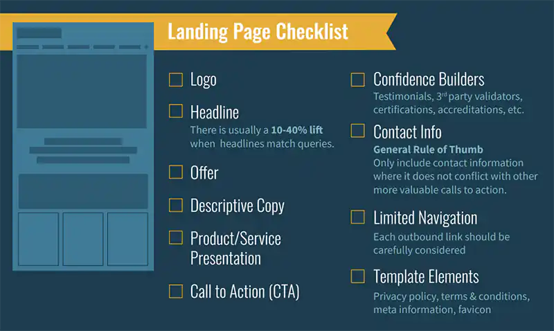
Landing page optimization checklist by closedloop.com.
Further reading: https://www.toptal.com/product-managers/digital/a-landing-page-design-guide
Josip Miskovic is a software developer at Americaneagle.com. Josip has 10+ years in experience in developing web applications, mobile apps, and games.
Read more posts →Last modified on:
- What is a good landing page conversion rate?
- What isn't working on your landing page? What is going well for you?
- Heatmap
- Session replay
- Surveys
- Page speed
- Headline
- Grab Attention
- PAS Framework
- Colors
- Navigation Bar
- Trust
- A/B Tests
- Forms
- Social Proof
- Address objections
- Features
- Bullet points
- Guarantee
- Images
- Search engine traffic
- Match the offer
- Tools
- Viral landing pages
- Free converts well
- Get inspired by top landing pages
- Keep testing
- Conclusion
- Landing page optimization cheat sheet

I've used these principles to increase my earnings by 63% in two years. So can you.
Dive into my 7 actionable steps to elevate your career.
