7 Conversion Rates Optimization Examples (up to 1647% uplift!)
Conversion rate optimization examples are a tremendous source of ideas. You can use them to increase conversion rates on your website.
There is a great variety of conversion rate optimization tools and techniques used with success across different industries and businesses.
This makes an exciting area for marketers who want to experiment.
In this article, I am going to share seven conversion rate optimization examples of ecommerce sites that are doing an excellent job.
Follow Steps to Reproduce to get the same benefits on your ecommerce website.
1. Site speed optimization brings $246MM to Fortune 50 company
MetaRouter's case study shows how a Fortune 50 company increased annual revenue by $246MM by focusing on site speed.
Page speed is a proven factor in ecommerce conversion rate:
- Amazon's sales fell by 1% for every 100ms of increased page latency documented in 2007 by Joakimi Kohavi.
- In 2017, Akamai discovered that 100ms page load delay reduces conversion rates by 7%.
- In 2020, Deloitte found that a 100ms reduction in mobile page load time resulted in a 1% boost in conversion rates.
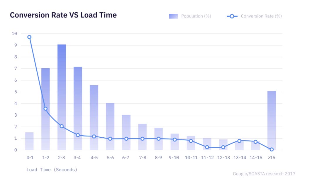
Conversion rate and load time - MetaRouter
Improved page load times made the user experience more enjoyable, which increased satisfaction and loyalty.
Also, the performance improvements had a positive impact on SEO. They saw a boost in Core Web vitals factors — First Input Display and Largest Contentful Paint.
How did they improve site speed?
They improved site speed by identifying, testing, and removing third-party JavaScript. The Fortune 50 company removed 6 scripts that were slowing down the site.
Steps to Reproduce
To improve site speed:
- Measure the current performance on GTmetrix.
- Identify slowest-performing JavaScript files.
- Answer: Are those tags/vendor critical to my ecommerce website?
- Remove JavaScript by one-by-one basis from the website.
- Measure the performance impact.
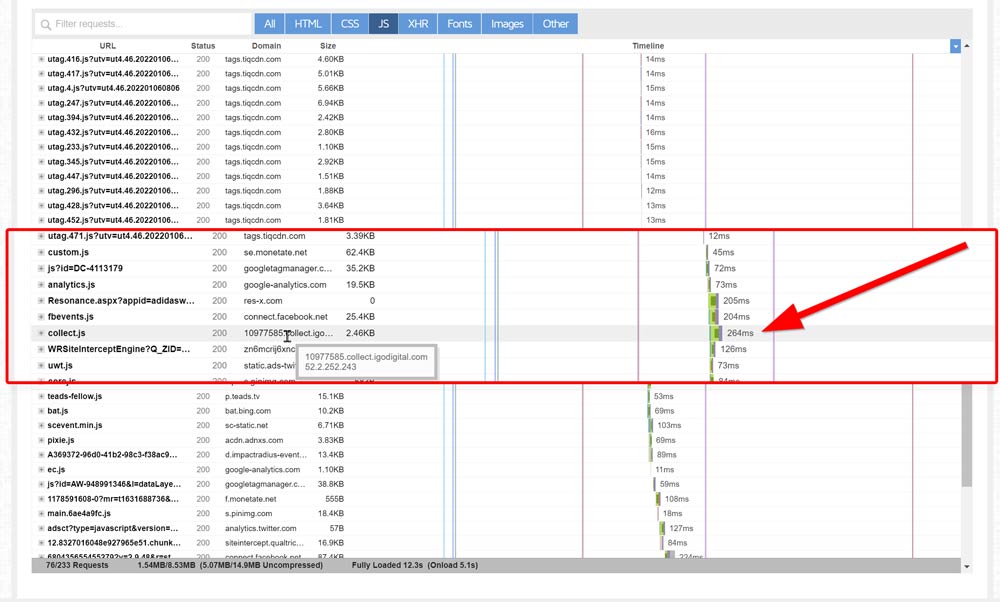
Use GTmetrix to analyze JavaScript.
2. “Hot Streaks” Increased Conversion Rate by 53%
Proof used social proof to increased conversion rates by 53%.
Social proof is a psychological phenomenon where people assume the actions of others reflect correct behavior.
For example, people are more likely to order food at a restaurant if it is busy.
How did they use social proof on their website?
The Proof team conducted an experiment by adding a “hot streak”. It's a notification that showed the number of people who bought the product in the past 24 hours.
They've analyzed the data of over 32,000 customers and found that including social proof.
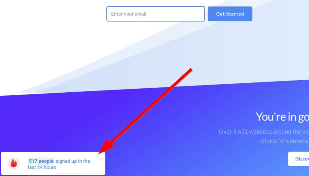
Popup example fom Proof
Steps to Reproduce
This might not be the best CRO technique if you are just getting started because you might not be getting a lot of sales.
If you are in ecommerce business, think about if adding social proof or urgency to your website makes sense for your products.
For example, if you have limited stock, using a notification that says “Only X left in stock” may be an effective way to increase conversion rates.
If you try the social proof experiment, use the conversion rate optimization calculator to figure out how the percentage increase will impact your profits.
3. OROS gets 60% Sales Increase from homepage redesign
OROS sells winter gear. Which means they have short selling season.
They have to capture first-time visitors immediately. So they've put all their focus on redesigning the web page to make a good first impression.
The result was an increase in sales by 60%.
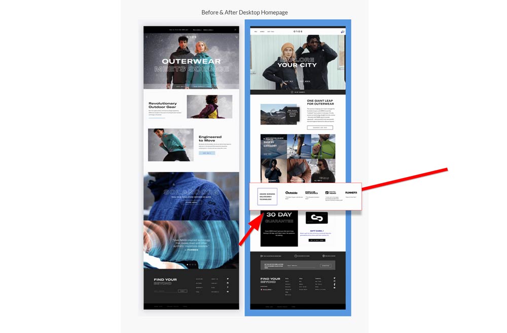
Homepage optimization example from OROS
How did they redesign the homepage?
Trust is the key because they are selling very expensive clothing. To build trust, they added "30 day guarantee" banner and reviews from credible media sites in their niche.
Steps to Reproduce
Add trust elements to site.
Do you have a money-back guarantee?
Many customers I've worked with have amazing return policies and money-back guarantees, but they don't promote them anywhere until the checkout page.
It will build trust and make potential customers more comfortable with buying from you, increasing conversions.
If I had unlimited time and budget: Add testimonials or videos of happy customer reviews right on product detail pages
Have others talk about you
Increase product exposure by working with publishers and journalists in your niche. The content will help to legitimize your brand in the eyes of potential buyers. When they publish it, add a badge or snippet of the article on your homepage to show social proof.
4. 81% email subscription growth by optimizing the product page
Leboutique.com is a clothing store with 4+ million monthly visitors. They wanted to increase their email subscriptions.
Techniques for the better email subscriptions significantly differ from techniques that increase sales. For example, you need to prove that you have a constant source of value to get their email.
The result was an increase of email subscription by 81%.
How did they increase email subscriptions?
They discovered that price was a major drawback for customers. They've interviewed 9765 participants and decided to A/B test the original page against a new design.
Since price was the biggest issue, they've got people to sign up for their email newsletter to receive exclusive discounts from their large catalog of sneakers. To capture the email address, they've added a pop-up to the product page.
Also, the new design put more focus on "lowest price", discounts, and scarcity.
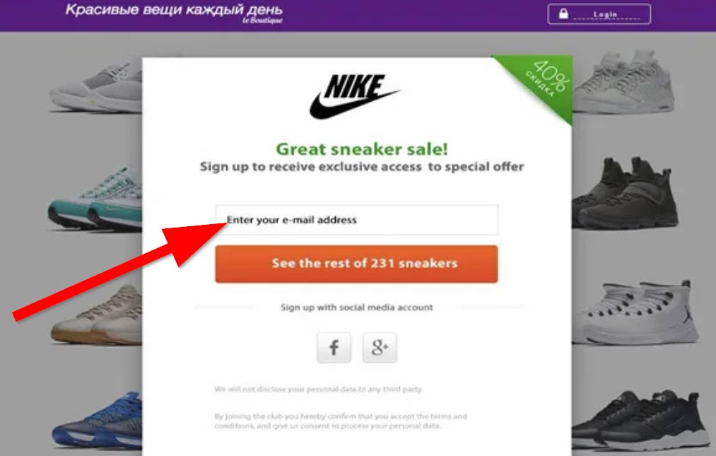
Email signup popup - conversionrate.store
Steps to Reproduce
Figure out what adds value to your customers.
If you can't figure out what adds value to your customers, you can always offer them discount.
But if you don't want to give discounts, you could try offering exclusive content or early access to sales. You need to dig deep and find out what makes them tick.
Are they looking for exclusive discounts? The lowest price? Latest trends? Trends in their city/country?
Once you know what they're looking for, you can create content and design that speaks to their needs.
Then, add a pop-up to your site to make it easy for customers to give you their email address.
5. Know your audience to get 1647% Conversion Uplift
CoachCare, a leading remote patient monitoring (RPM) and virtual health solutions provider, increased leads by 1647% percent after optimizing the landing page.
How did they do it?
The Wedge Method aka foot-in-the-door.
The Wedge Method is a method for generating high-value conversions "wedged" in a low-friction conversion path.
By knowing the audience that clicked on the ad, they could target them with a relevant offer on the landing page.
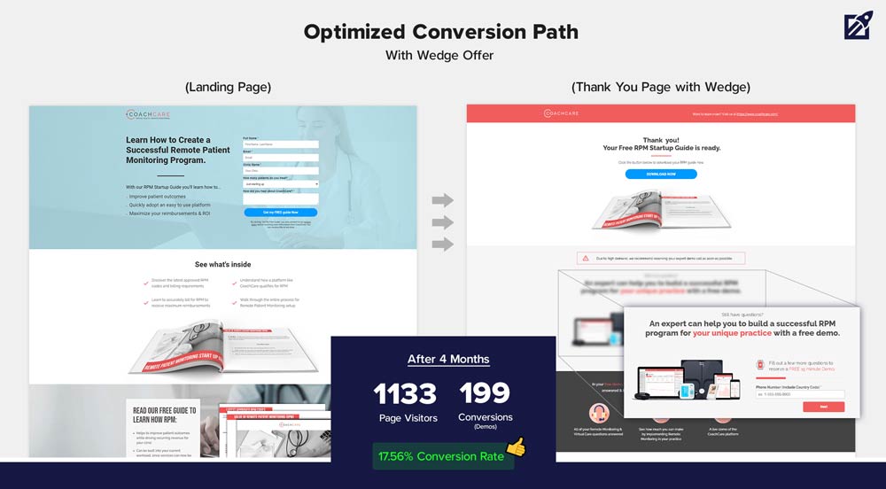
Optimization from lineardesign.com
Steps to Reproduce
Consider a conversion path to be a tiny slice of your conversion funnel. Focuses on the minor steps required to transition a website visitor from one funnel stage to the next.
Linear outlines the 5-step method on how to master The Wedge Method:
- Understand your conversion funnel
- Find the high-friction points causing users to bounce
- Use a lead magnet to drive your wedge offer
- Position the wedge in your conversion path
- Track target conversions and results
6. 700% boost from content marketing for a Fintech company
Pomelo Pay used their blog to increase conversion.
The measurement of content marketing is complicated since indicators such as brand awareness, community participation, and reputation are difficult to quantify.
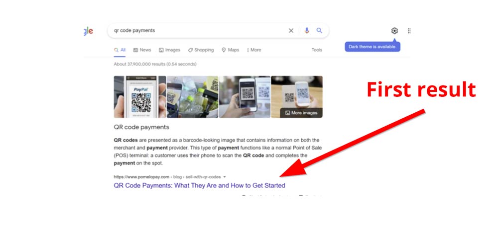
mintcopywritingstudios.com
How they optimized their content?
The optimization their content they focused on:
- Matching the search intent of customers.
- Answering "People also Ask" questions from Google.
- Adding clear Call to Action at the bottom of every article.
- Redesigning the blog pages.
Steps to Reproduce
Remember to keep optimizing. Find your best performing content and optimize for conversion.
Does your page have:
- A powerful headline?
- Compelling images?
- Helpful and relevant videos?
- Titles that are catchy and interesting?
- Bullet points with clear benefits?
- Good grammar, spelling, and punctuation?
- Short paragraphs?
- Clear Call to Action?
A high-quality blog post will help you keep your audience coming back for more. It is also a great opportunity to improve SEO and increase site traffic. And that means an increased chance of converting visitors into leads, buyers, subscribers or clients.
7. Value proposition brings 132% conversion increase
CORGI HomePlan is a home insurance company in the UK.
They've used several methods to increase their conversion rate, but their primary focus was on making sure customers understand their value proposition.
Value proposition is a statement that summarizes why someone should buy your product or use your service.
Visitors understood little about Corgi’s unique selling points and what made the company different from others in the market.
Language on the website didn't match the language from other marketing channels.
In order to fix this, they've added a clear value proposition on the homepage and every landing page. In addition, they made sure that visitor can see their primary product features across all pages of the website.
The result? Conversion increased by 132%.
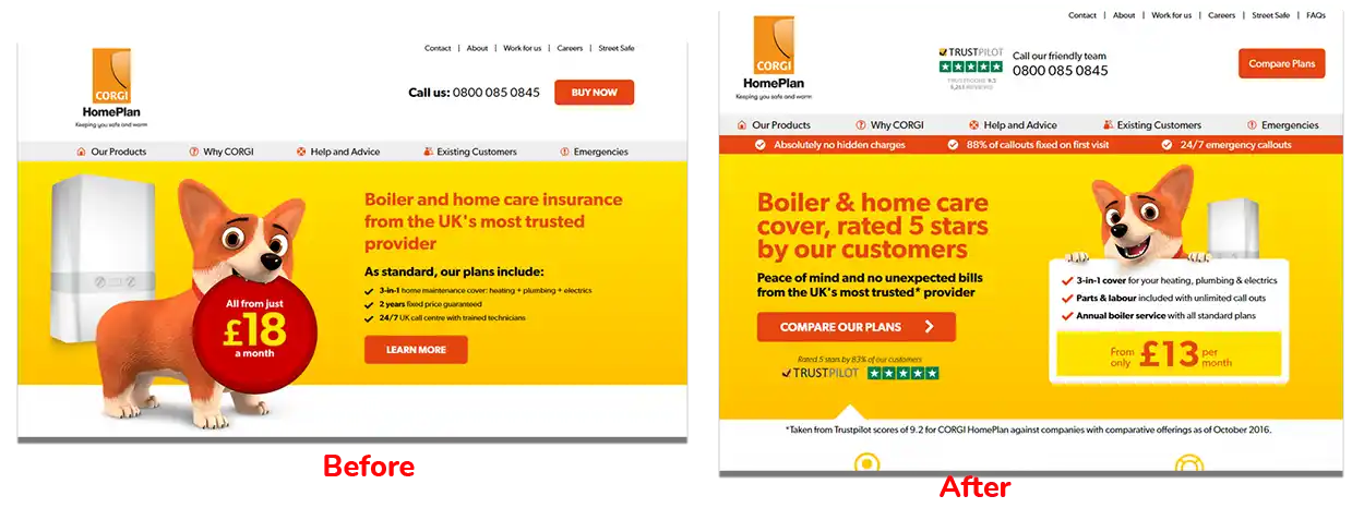
Optimization from worship.agency
How to use value proposition in ecommerce?
They started by understanding their customers and prospects. They did that by focusing on data.
Through qualitative and quantitative analysis, they gathered info on:
- how visitors think about insurance and risk
- how the client is perceived compared to the competition
- how visitors behave on the website
- what motivates people to purchase
- what stops people from purchasing
Then they identified the language that is most relevant to them and their needs.
And finally, designed a clear value proposition with an effective headline for every landing page.
Increase conversions by using less text on your website:
Steps to Reproduce:
- Understand your audience: You need to understand their needs and what motivates them before you can create content that speaks to them.
- Make sure your value proposition is clear and easy to understand
- Match the language on your website to that of other marketing channels
- Feature your primary product benefits prominently on all pages of your website
- Measure the impact of changes before making more
Conclusion: Apply these on your website to increase conversions.
The five examples of examples of CRO that I shared in this article are just a few among many. Each of these businesses has found unique ways to increase their conversion rates, and you can learn a great deal by studying their methods.
They took different approaches, but they all had one thing in common:
→ They focused on their customers and what would motivate them to buy.
If you want to increase the conversion rate of your website, start by understanding your audience and what matters most to them.
Then make sure your value proposition is clear and easy to understand.
Match the language on your website to that of other marketing channels, and prominently feature your primary product benefits across all pages.
Finally, measure the impact of changes before making more. Apply these steps on your website to see an increase in conversions!
Remember:
- Site speed is a proven factor in ecommerce conversion rate. If you want to improve your website's performance and increase the chance of conversions, consider removing any third-party JavaScript that may slow down your site.
- Social Proof is an effective optimization tactic for ecommerce websites. The social proof of other customers buying the product increases trust and may increase your chances of a customer purchasing from you.
- Money-back guarantee is a powerful tool to increase confidence for potential customers and encourage them to buy from you. The guarantee should be unconditional and easy to claim.
- Content Marketing increases brand awareness, site traffic, and conversions. But to see these benefits, you need to create high-quality content. Use it to engage your audience and provides them with value. Remember to keep improve content to perform at its best.
- The wedge method is a powerful way to increase conversions by targeting users who have already clicked on your ad. By understanding your conversion funnel and identifying the high-friction points, you can use a lead magnet to drive your wedge offer and position it in your conversion path. This will help increase the chances of users converting.
- Value proposition is a statement that summarizes why someone should buy your product or use your service. It's important to make sure your value proposition is clear and easy to understand, and that it matches the language of your customers.
Josip Miskovic is a software developer at Americaneagle.com. Josip has 10+ years in experience in developing web applications, mobile apps, and games.
Read more posts →- 1. Site speed optimization brings $246MM to Fortune 50 company
- How did they improve site speed?
- Steps to Reproduce
- 2. “Hot Streaks” Increased Conversion Rate by 53%
- How did they use social proof on their website?
- Steps to Reproduce
- 3. OROS gets 60% Sales Increase from homepage redesign
- How did they redesign the homepage?
- Steps to Reproduce
- 4. 81% email subscription growth by optimizing the product page
- How did they increase email subscriptions?
- Steps to Reproduce
- 5. Know your audience to get 1647% Conversion Uplift
- How did they do it?
- Steps to Reproduce
- 6. 700% boost from content marketing for a Fintech company
- How they optimized their content?
- Steps to Reproduce
- 7. Value proposition brings 132% conversion increase
- How to use value proposition in ecommerce?
- Steps to Reproduce:
- Conclusion: Apply these on your website to increase conversions.

I've used these principles to increase my earnings by 63% in two years. So can you.
Dive into my 7 actionable steps to elevate your career.
